5 Things you need to know before designing a website
3 mins | Dec 15, 2021

In today’s tech-savvy world, a business needs to have a digital presence. A digital presence can be anything; a website, a blog or just a social media platform.
For many business owners, just the thought of creating a website can feel overwhelming. You could search one of the many freelancing websites and spend countless hours searching through the endless talent, but how would you know you could trust them, or that they have the experience they quote to be able to deal with the things you need? You might instead consider using a digital agency, but the costs involved can far exceed any budget that you put aside.
A website has many benefits. Besides being identified in the digital world, it can help you source leads for your business.
Here are the top 5 things every marketer must keep in mind before designing a website.
1. Design a clean and attractive wireframe:
One of the most important things to remember during the process of website development is to create a clean, appealing design. A quality design is attractive and easy to read with intuitive navigation.
Most importantly, a clean design helps viewers focus on the value of your brand and content instead of distracting graphics and large amounts of text.

Often, customers associate website designs with the quality of a particular company or product. Hence, a clean design is vital to providing a positive user experience that encourages customers to return.
2. Finalizing the target audience:
The number one and most important factor that separates successful websites from those that miss the mark is understanding and Knowing your business or organization’s target audience.
A clear understanding of audience involvement and knowing how your audience is important. learns and decisions that your audience makes will provide a framework that will impact every part of the website design process.
3. Wireframe of the entire website:
The one thing that needs to be completed at the very beginning of any website development project is Creating a site map. The information you want your website to communicate, and determining the best number of pages is the important area where you should start thinking.

Start mapping out all of the pages that you want to include in your website considering the user experience, As you plan your website.
4. Choosing the colours that correspond with your brand values:
When selecting colours for your site, it’s tempting to take the easy route and just use a default colour scheme that comes with your website building software or theme.
That’s not necessarily a bad thing to do, as long as you can match the colour scheme with your brand and message. If you’re not happy with your colour choices, you need to sort it out before your launch date.
Make sure you check and approve all the colours on your site, ensure that you stick with your brand’s colours, and don’t choose any colours that are too extreme. Avoid a high-contrast colour scheme and colours that don’t work stylistically and functionally with your website’s aesthetics and layout.
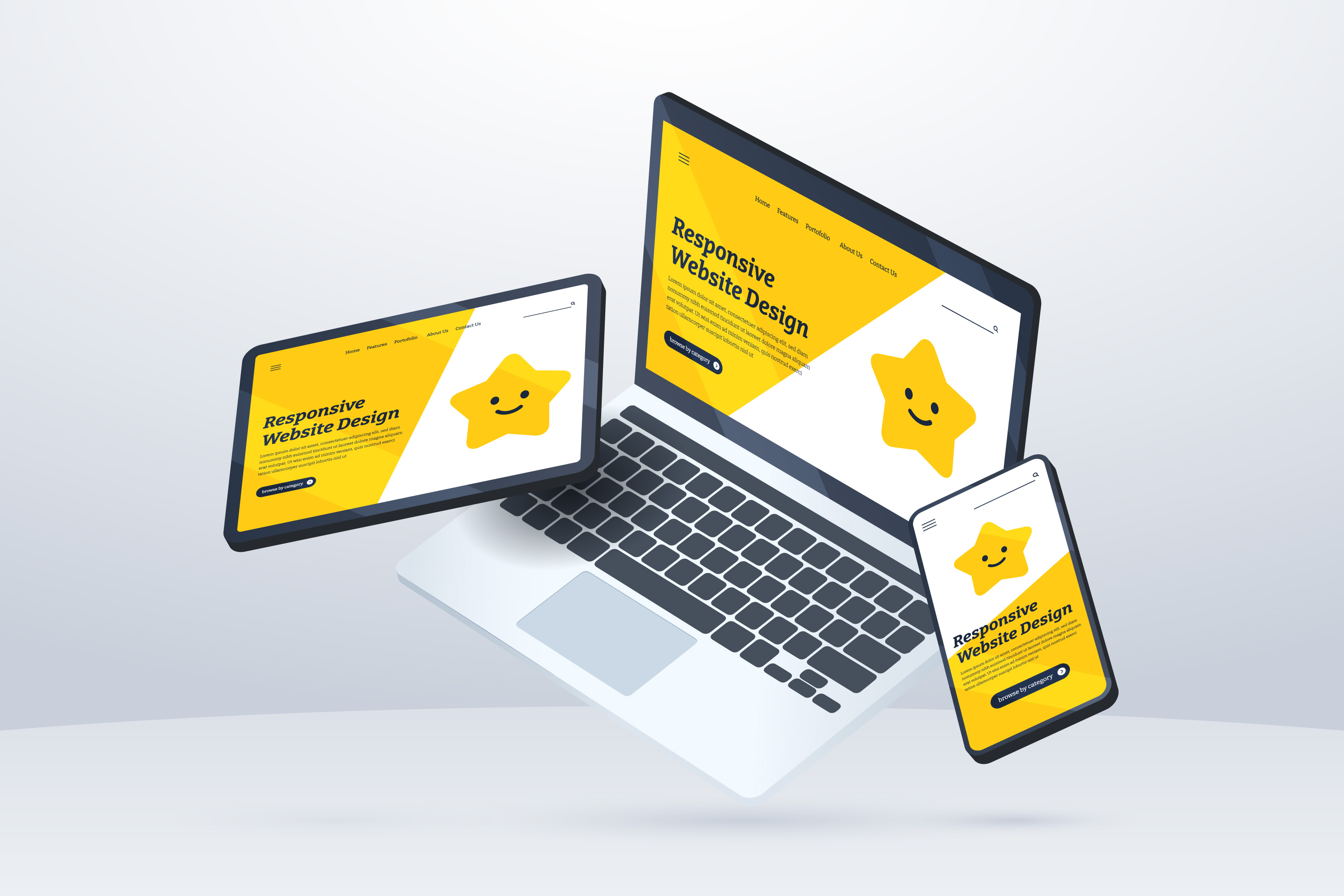
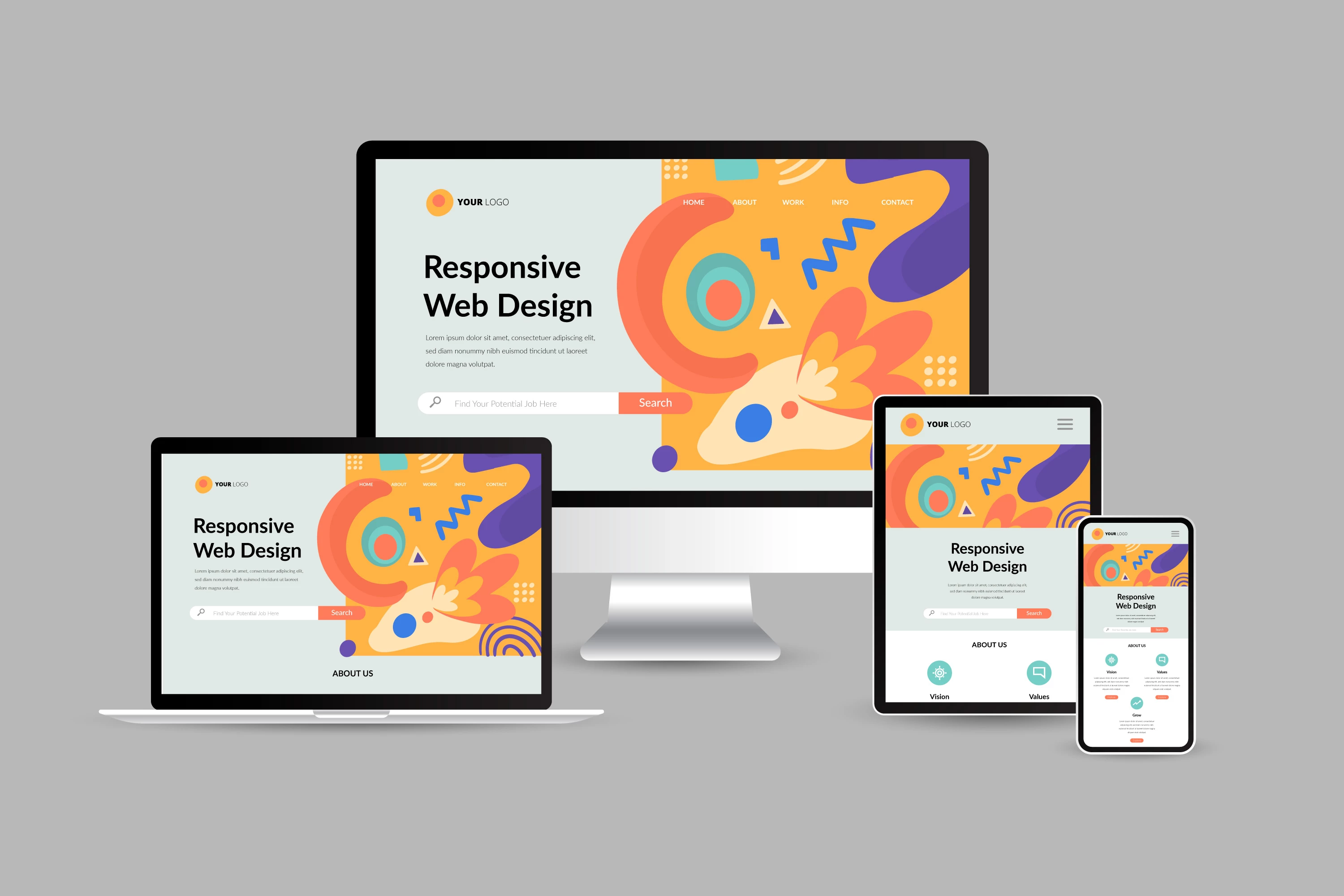
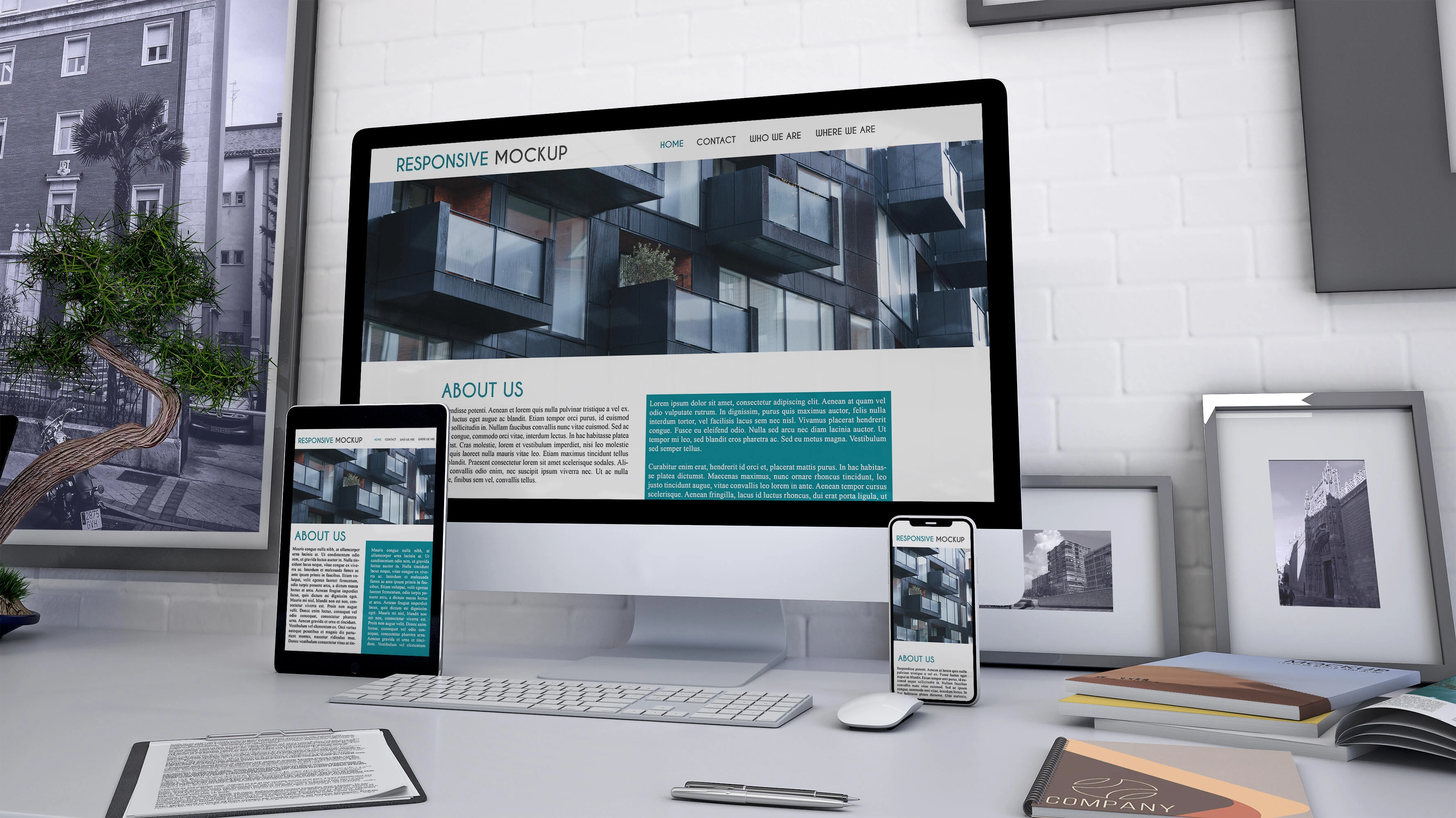
5. Responsive on mobile devices:
Approximately, 95% of mobile device users count on their devices to search for local products and services. To effectively reach this growing population of mobile users, businesses need to be sure that their websites are available from any device.

Providing mobile-friendliness is one of the most effective ways to keep visitors on websites longer. People are more likely to stay on a website that is easy to use and are less likely to leave it, which means you that a mobile-friendly website reduces your bounce rate. Eventually, this increases your chances of getting business.
Conclusion:
As you can see, there are many things you can do to ensure that the most important features of your website are up and running before you launch. We’ve barely scratched the surface though, and there are many more tweaks and optimizations that you can apply.
There’s always something extra you can do to help boost your visitor numbers. With a bit of work and a few changes here and there, you can reshape the way your website attracts and keeps visitors.
Author

Share
Share
Related

Top 15 Figma Tricks & Tips for a Designer
6 mins : Mar 09, 2023

The Future Of Responsive Web Design: Emerging Trends, Innovations And Predictions In 2025
7 mins : Apr 23, 2024

Everything You Should Know About The Ideal Screen Size For Responsive Design
6 mins : Apr 26, 2024


