Top 9 UI/UX Trends to watch out in 2025
6 mins | Mar 14, 2024

Every $1 invested in UX results in a return of $100 (ROI = 9,900 percent). - “Forrester” study says that around 39% of audience members stop engaging with your website and choose to quit when the website takes too long to load. Surprisingly, because of your website's rough performance, you may never get engagement back from your 88% of visitors.
All these numbers are true and have been proven by many deep surveys. Now you can imagine how proper UI/UX designs help your business grow and give you an ROI on your long-term investment.
UI/UX designers are the most demandable candidates for today's business growth. There is no doubt that graphic designers are creative thinkers, but market demand is always high for UI/UX skills, and candidates who have both knowledge are shortlisted first. So, this blog is helpful for both designers who are working to improve their skills and businesses that want to put their strong image in a competitive market.
Our blog is published to highlight the UI/UX trends of 2025 and how you can improve your website’s UI/UX experience. Take a look at the 9 best UI/UX designs to help improve your website in 2025.
Importance of UI/UX in your website
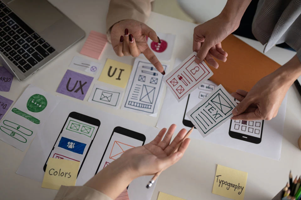
UI design is important for making digital platforms easy for everyone to use. It's all about how elements look and work in apps or websites so that people can use them without getting confused. UI designers need to understand things like fonts, colors, buttons, and menus very carefully to make everything look good and work better. They organize everything in a way that makes sense so users know what to do, like clicking, tapping, or swiping.
On the other side, UX design is about making sure people have a great time using your website. It covers everything about how a product is designed and works to give users a good experience. UX designers do research to understand what users want and then make sure using the product is fun and effective. They test how people use products and improve them based on their responses.
Top 9 UI/UX trends of 2025
Every year, surveys find some new activities and customer requirements and choices as per new technology and device upgrades. Here are some new trends of 2025 that UI/UX developers can use while developing any website.
1. Animated Cursors
Animated cursors are the first element of the website that engages with the user's eyes. You can grab the user's attention by making some visual changes and letting animation play with the cursor move. When users see animated cursors, such as spinning wheels or progress indicators, they observe that their actions are being processed, which reduces frustration and uncertainty.
Animation cursors can transmit information about the system's status or the progress of a task, keeping users informed and empowered. It helps improve website functionality with new visual functions and aerodynamic designs. One way to keep users from getting impatient or thinking the system is frozen is to show them that the system is working on a task with a loading animation.
Animated cursors can also add personality and style to the user interface, adding to its overall aesthetics and brand identity. By carefully designing and implementing animated cursors, UI/UX developers can create immersive and delightful experiences that leave a lasting impression on users, ultimately driving engagement and satisfaction with the product.
Read More: Top Web Design Trends
2. Typography
The second key element that impacts your customers' minds is your website typography. Typography is an important UI/UX development component, as it organizes user experience. The choice of fonts, font sizes, and typography styles drastically influences how users understand and interact with content interfaces. Clear and legible typography improves readability, helping users consume information without strain or confusion.
Typography contributes to visual structuring by drawing users' attention to the most important elements on the screen. Through strategic use of typography, UI/UX designers can prioritize information, improve navigation, and simplify the user journey. For example, headings and subheadings with specific typography styles can assist users in quickly scanning and locating relevant content sections.
The consistent use of typography across screens and platforms promotes brand recognition and maintains brand values. Whether it's a sleek and modern typeface for a startup or a classic and elegant font for a luxury brand, typography is important for presenting the brand's identity and making a lasting impression on users.
3. Bento box designs
Bento box designs are gaining popularity in UI/UX development after Apple used these designs on their devices. Inspired by Japanese lunch boxes, bento box designs divide the interface into visually distinct compartments, each serving a specific purpose or containing related content. This modular approach organizes information and functionality better, making it easier for users to find and access desired features.
Flexibility and scalability are two of the primary advantages of bento box designs. UI/UX designers can easily rearrange or add new compartments to accommodate changing user needs or evolving content requirements. Bento box designs create consistency across different screens and devices.
Read more: The Key Role of Web Design in Modern Business Success
4. 3D Design in Website
3D Design presents authentic content and communicates in depth with users. 3D design concepts in UX design revolutionize the user experience of web sites. With 3D models, animations, and effects, websites can create a more engaging and memorable interaction with users. Users can feel a special environment on the website and interact with products closely.
3D animation gives a little story to your website and draws users in smoothly. This feature makes your website unique among other websites. 3D design is an open new way to engage your website and make it smooth and visually appealing for users. Websites that use 3D design elements can differentiate themselves from the competition and leave a lasting impression on visitors.
5. Minimalism Website
Minimalism is going to become a popular web design trend in 2025. The website's simplicity, clarity, and functionality make it more engaging and popular among users. This typically requires a simple color palette, understated but bold typography, a small number of competing elements, and a single focal point.
One of the primary benefits of minimalism in website design is better usability. With fewer distractions and a clear structure of information, users can find the website and find what they're looking for without becoming overwhelmed. Furthermore, minimalist websites frequently represent a sense of sophistication and elegance, improving the brand's image.
6. Hyper personalization
The practice of modifying products, services, and experiences to meet individual users' unique needs and preferences is known as hyper-personalization. It goes beyond traditional personalization by combining advanced data analytics, artificial intelligence, and machine learning algorithms to deliver highly targeted and relevant content in real-time.
One of the key advantages of hyper-personalization is its ability to improve user engagement and satisfaction. Businesses can strengthen their connections with their audience and increase customer loyalty by providing personalized recommendations, offers, and experiences.
7. Micro Interactions
Micro-interactions are small actions that happen on websites when you do things like hover over or click on specific parts. They usually come with animation or sounds to show that something has changed. These interactions can serve a practical purpose in making a website easier to use, or they can just be there for decoration, adding a bit of flair.
Before, it was hard for designers who weren't very technical to include micro-interactions in their designs. But now, with tools like Vev that don't require coding, it's much simpler for designers to understand and add these little touches themselves, making sure they blend well with the rest of the design. Micro-interactions can be triggered by user actions, such as clicking, or they can occur automatically as the user navigates the website.
8. Dark Modes
Dark mode is like a different look for websites and apps. Instead of bright colors, it uses darker ones with light text. This can make it easier to look at, especially in the dark, because it doesn't shine as much light into your eyes. It's helpful for people who have trouble with bright screens or want to save battery on their devices.
Some people just like how it looks better, especially when using their devices at night. This is not a new trend this year, but it’s the first choice of all aesthetic and old popular websites using this for decades Apple, YouTube, and Google have used dark mode for years, but it’s becoming more of a default in UX.
The dark mode gives users an aesthetic, simple, and professional look. Also, dark colors contrasting with a matching layout put a different image on the user's mind. Your user can't get frustrated or tired by observing your website for a long time.
It creates a calm and peaceful impact on the user's mind. Mixing dark themes and good typography in your website gives you another level of impression in the market. Overall, it's a nice feature that makes websites and apps more comfortable to use, giving people more choices for how they want things to look.
9. Accessibility
In the last point, we recommended maintaining good accessibility for your whole project. Accessibility is the key to managing everything in a minimal way. Making sure universal accessibility and successful interaction with digital content are imperative, irrespective of an individual's abilities, with every customer.
Accessibility measures go along with suggesting alternative text for images, using clear and easy-to-read fonts, including keyboard navigation options, and designing interfaces that work well with screen readers.
Businesses and developers can verify that their products are usable by a broader range of people, including those with visual, auditory, motor, or cognitive impairments, by putting accessibility first. This not only promotes inclusivity and diversity but also assists businesses in meeting legal requirements and improving their reputation as socially responsible organizations.
Demand for UI/UX in markets
The demand for UI/UX (User Interface/User Experience) professionals will stay strong in 2025 and beyond. Here are some reasons why:
Technological Advances: New technologies like AR, VR, AI, and voice interfaces are becoming more common in digital experiences. UI/UX designers who understand these technologies will be needed to create user-friendly interfaces.
Mobile and App Development: Mobile apps are crucial for accessing digital content and services. UI/UX designers play a key role in making mobile interfaces easy to use and visually appealing.
Constant Changes: The UI/UX field is always evolving. Companies need designers who can keep up with new technologies and design trends to stay competitive.
E-commerce Expansion: With the continuous growth of online shopping, there is a high demand for UI/UX designers to create seamless and intuitive interfaces for e-commerce platforms.
Accessibility Focus: As inclusivity becomes increasingly important, there is a growing need for UI/UX designers to prioritize accessibility in their designs.
Read More: Top 11 Web Development Frameworks Every Developer Must Know About In 2025
Conclusion
UI/UX trends of 2025 are not only here; you can find new ideas and implement them in your project, which will help your website get more traffic and customers would like it. You have to be aware of your personal preferences and behaviors to stay ahead of the competition. Understand the customer's needs and fulfil them with your expertise to create a successful website. A positive user experience and, eventually higher conversion rates can be achieved by keeping up with the latest trends and consistently refining the design of your website.
12Grids helps you build brands to present their story to customers. Hire our expert web development team and build your project with us to make it more successful in the market. We use cutting-edge website development technologies and adhere to new SEO best practices.
FAQs
How will AR/VR change UI/UX trends in 2025?
AR and VR will make interfaces more immersive and interactive. They'll be used in shopping, gaming, training, and more, changing how people connect with brands and products. Designers will need to create intuitive experiences with cool gestures and visuals that blend digital and real life.
Why is dark mode popular in 2025?
Dark mode is popular because it looks simple and makes people focus on content. Studies show it reduces eye strain and improves concentration. Designers can make dark interfaces stylish and easy to read by using the right colors and fonts.
How is motion design evolving in 2025?
Motion graphics are making interfaces feel more dynamic and fun. New technologies like WebGL are bringing 3D graphics to life, making interactions memorable and engaging. With motion, designers can tell stories and guide users through experiences in creative ways.
What's immersive scrolling, and how will it impact 2025 trends?
Immersive scrolling is about making scrolling through content feel like an adventure. It uses cool effects like parallax and animations to make websites feel like movies. This makes exploring content more exciting and interactive.
What benefits do 3D elements offer for 2025 trends?
Adding 3D elements to designs makes them feel more real and exciting. It grabs users' attention and makes interfaces easier to remember. Plus, it's great for things like virtual try-ons and product configurations, making online shopping more fun and interactive.
Author

Share
Share
Other Articles

The Future of Customer Experience: 2025 Trends Every Business Needs to Know
5 mins : Apr 21, 2025

How Businesses Can Benefit from IoT and AI's Powerful Combination
7 mins : Mar 20, 2025

How to Train Your Mind to Think Like an End User While Testing Applications
5 mins : Mar 05, 2025
