15 Best Website Designs for Banks & Financial Institutions
6 mins | Apr 04, 2022

In this digital world, the banking industry's landscape changed over time and has been known for meeting all the customer requirements & expectations for convenience and acceleration. Currently, customers are progressing with the advancement of technology and moving towards the self-service standard as they manage all their banking transactions and other relevant work on smartphones, desktops, tablets, or laptops.
The first & foremost thing that a customer analyses while deciding on a banking service provider is the website. Every customer out there wants their banks or financial institutions to provide the best facilities & services. They want a creamy experience that would make things easier and more relaxed by having all these characteristics, such as user-friendly & responsive design across all the platforms, a high level of safety & security of the website, highly contextual & relevant, personalization of the products & services and brand consistency & many other functionalities.
However, many banking websites have been stagnant for so many years. Still, on the other side, some websites are moving forward with new & fresh website designs using exceptional functionality, which will help increase brand awareness, engage users, and convert prospective customers.
Quick Tip - Read why responsive website is a way to go forward!
Here's a list of banks or financial institutions' 15 best website designs that will inspire you in many ways.
Let's dive right in.
1. KeyBank
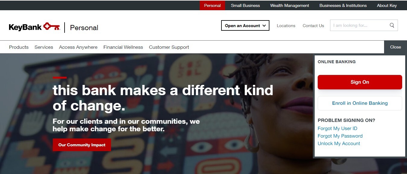
Keybank is a financial institution & a regional bank that is a primary subsidiary of KeyCorp and is based in Cleveland, Ohio(United States). It is the only major bank in the entire city. The branding of KeyBank is simple and effective at the same time. A key for their logo appears on their homepage and every subpage, and a collective bold color scheme of red, grey & white keeps their customers attracted and impressed. Also, a sleek sign-on button placed on the right side of the website & takes significantly less space is unique in design.
The CTA on the homepage - Come on in, provides a warm welcome to visitors and customers, and it feels like a gate key. If someone clicks on the CTA, they will be able to see an abstract appearing on the screen, displaying the bank's offerings with personalized videos and content. Once the visitor selects the relevant sub-tab, the sidebar is visible on the right of the website, which features everything starting from the login button to the rates, which is one of the most impressive design aspects.
Suggested- 10 Web designs principles that boost your conversion rate
2. Wells Fargo
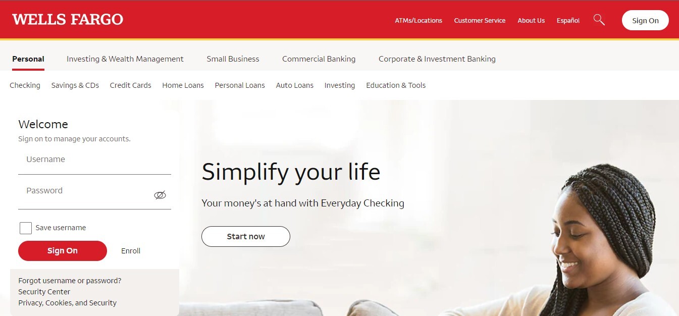
Wells Fargo & Company is an American financial services institution with its corporate headquarters in San Francisco, California. The operational headquarters is based in Manhattan and has managerial offices all over the United States and internationally. It is a diversified, community-based financial institution.
The website of Wells Fargo is super responsive, which makes it smooth & easy to navigate across all devices. The website's straightforward design has attractive images laid out nicely to deal with all clients' personages. Although Wells Fargo is one of the largest banks, it has come up with a section called "Small Business" on the home page that tries to communicate with the relevant customers to build trust and loyalty.
Altogether, the website of Wells Fargo is extraordinarily spontaneous and user-friendly, with pre-eminent CTAs for every service provided by the bank itself, from opening a savings bank account to your retirement plans. Together, the bank and its website ensure being a trusted partner for their existing and prospective customers.
3. People's United Bank
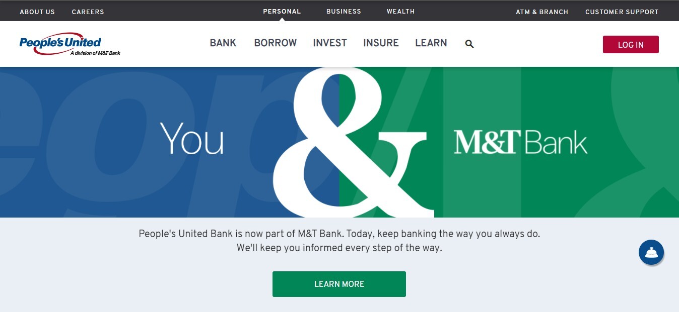
People's United Bank is a subsidiary of a diversified, community-focused financial services institution named People's United Financial Inc. The People's United Bank website design is way too pristine and straightforward, having a white overlay for a tunnel vision of the bank's offerings.
The website of People's United Bank offers an amazing option to make a comparison between accounts, and it enables customers to personalize their banking experience. Moreover, the website also shows pop-ups after the first few seconds that are placed elegantly, and most importantly, it doesn't cover the entire screen space.
Concurrently, some of the information is highlighted, having a blue background with red CTAs to attract attention.
4. Zenith Bank
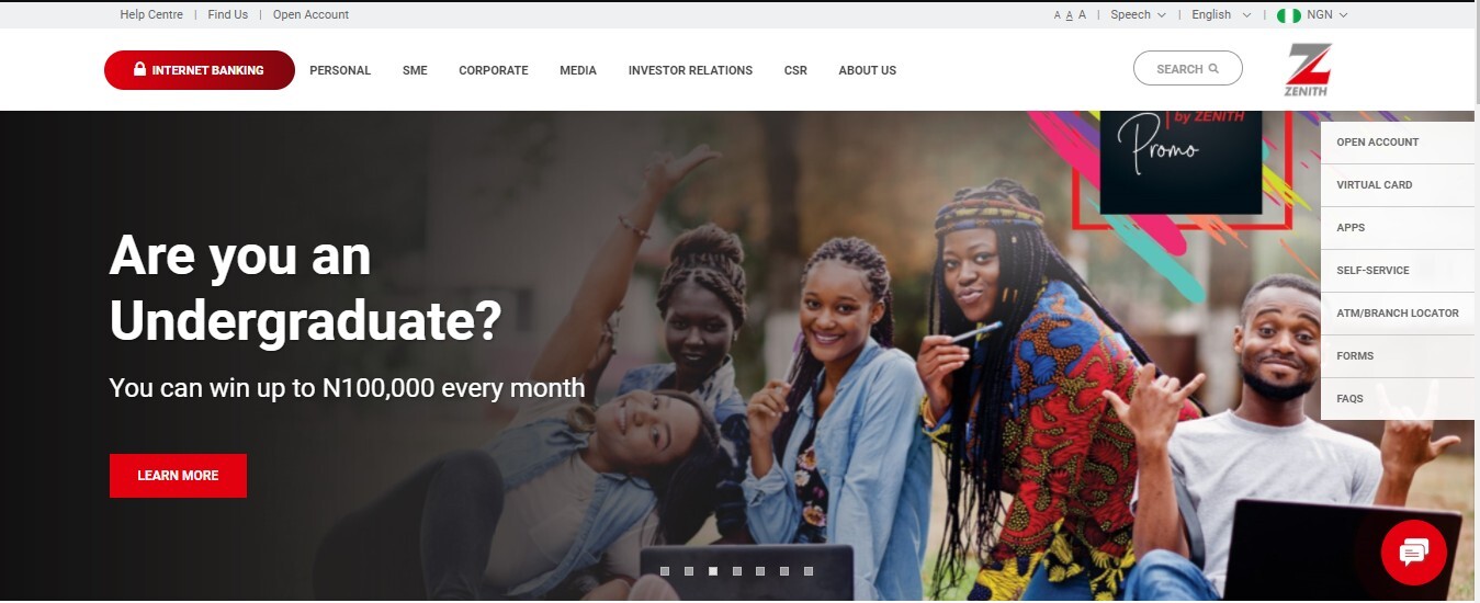
Zenith Bank provides financial services worldwide and has a presence in many countries, such as Ghana, Sierra, Nigeria, the United Kingdom, Gambia, and Leone. Zenith Bank's website is listed here for several reasons, and the first one is because of the professional look of the website design, which makes the bank look authoritative.
Unlocking Inspiration: Exploring Chemical Manufacturing Website Designs
Additionally, the animation, custom background, and consistency are some of the other elements that grab more attention & interest of the people. Also, the standstill sidebar is really helpful for the visitors & customers to navigate the tabs smoothly and efficiently.
5. ICICI Bank
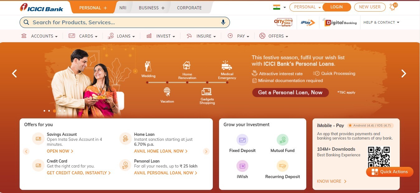
ICICI Bank Limited is an Indian multinational bank and financial services institution with its headquarters in Vadodara, Gujarat. The website of ICICI Bank is like a supermarket that provides financial services. The website consists of many vibrant colors that deliver a relaxing & refreshing experience to its visitors.
Incorporating an online chat feature called "Askipal" gives an impression like Apple's Siri. ICICI has considered its modern-age customers as it provides WhatsApp banking and iPlay Digital Banking solutions.
Embrace the Power of Responsive Design
The website's homepage includes quick video tours, which is a good example of how ICICI Bank has realized the needs of its customers and has come up with all the necessary elements to deliver an effortless experience. Also, notification pop-ups at the top right corner of the bank's website communicate about the personalized offers that target first-time visitors and have friendly help & support assistance that makes it easy for the customers to reach out.
6. Heritage Bank
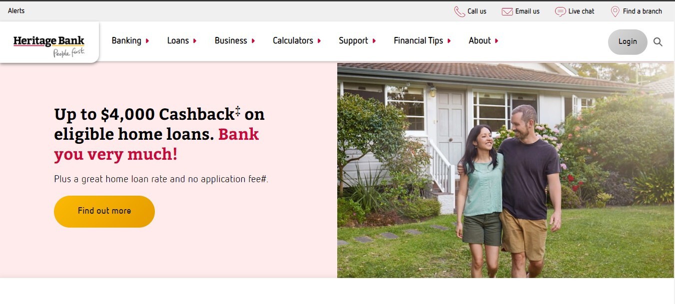
Heritage Bank Limited is the second-largest mutual bank in Australia. Its head office is based in Toowoomba, Queensland. Heritage Bank has over 50 branches in New South Wales and Southern Queensland. Heritage Bank's Website boldly illustrates the competitive fixed interest rates that help gain loyalty, integrity, and clarity among its clients.
If you scroll down the page, you will be able to catch sight of the awards and CTAs(call to action) that promote taking the right step and helps in discovering a close branch for the customers so that they can quickly get in touch with them. The conversion rates are highly influenced by the relevant positioning of the content considering the visitor's intentions on the mind.
7. P&N Bank
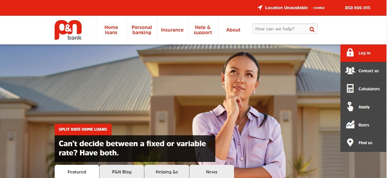
P&N Bank is an Australian-owned bank managed by Western Australia and is a division of Police & Nurses Limited. It is regulated under a mutual model and provides all retail banking services such as insurance & financial planning services and savings & lending products. It has a network of more than 15 branches in Western Australia. The website of P&N Bank is a fabulous example of an outstanding web design.
P&N Banks' website has performed a commendable job as it has combined the red and white colors of the brand with a custom background on the homepage. It has placed its messages and information for its potential clients and existing customers. The sidebar is located on the right of the homepage, accentuating every detail, from the login button to the rates, which is praiseworthy.
8. Bank Of Melbourne
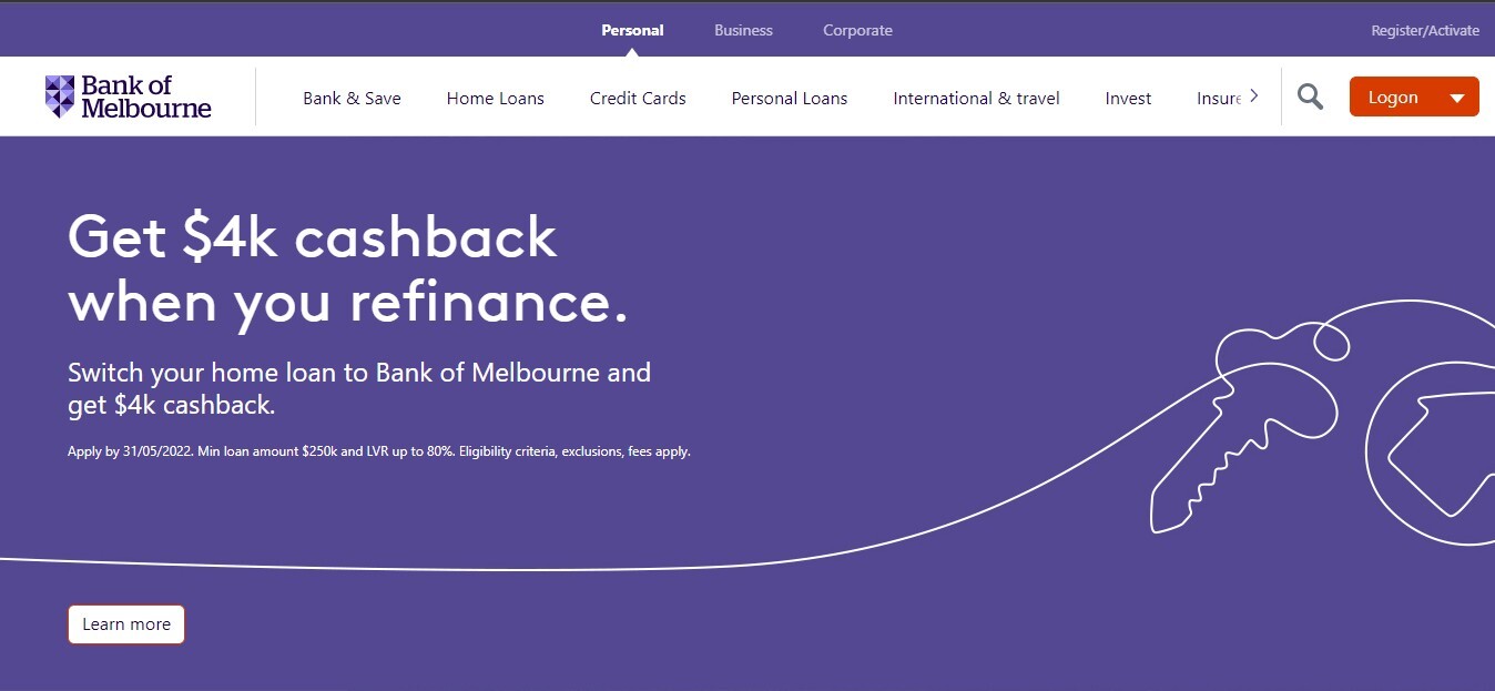
Bank of Melbourne, a subsidiary of the Westpac Group, is a financial institution that operates in Victoria, Australia. The website of the Bank is a glinting example of a subtle and pristine design that looks amazing on any kind of device. The user experience team has marvelously designed every minor detail on the bank's website.
The design of the website does not overwhelm surplus options. The website ribbon is remarkable as it is designed as a carousel to display the most appropriate product and services offered by the Bank of Melbourne. Moreover, the bank has listed the interest rates of home loans at the bottom of the home page, making it easy for visitors to compare the Bank of Melbourne & other banks.
9. Live Oak Bank
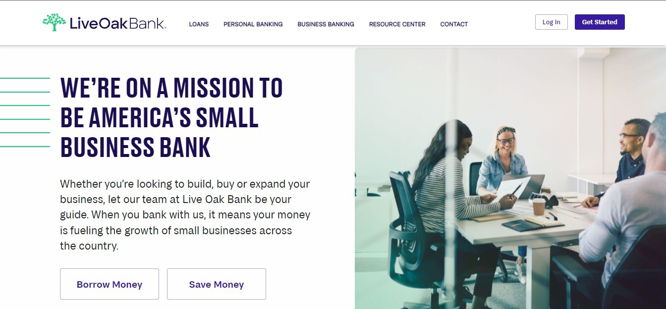
Live Oak Bank is an American bank and a subsidiary of Live Oak Bancshares Inc. Its headquarters are located in Wilmington, North Carolina. Live Oak Bank serves owners of small businesses in all 50 states. The website of Live Oak Bank has a minimalist approach to providing the most precious information to its visitors. It provides visitors with an informational and translucent experience, such as savings interest rates, loan rates, calls to action, and contact information. It helps drive in new customers and allows the visitors to dig deeper into the website. The website's product pages are educational, and the bright customer reviews help build credibility and help distinguish between Live Oak Bank and its competitors.
10. Cargills Bank
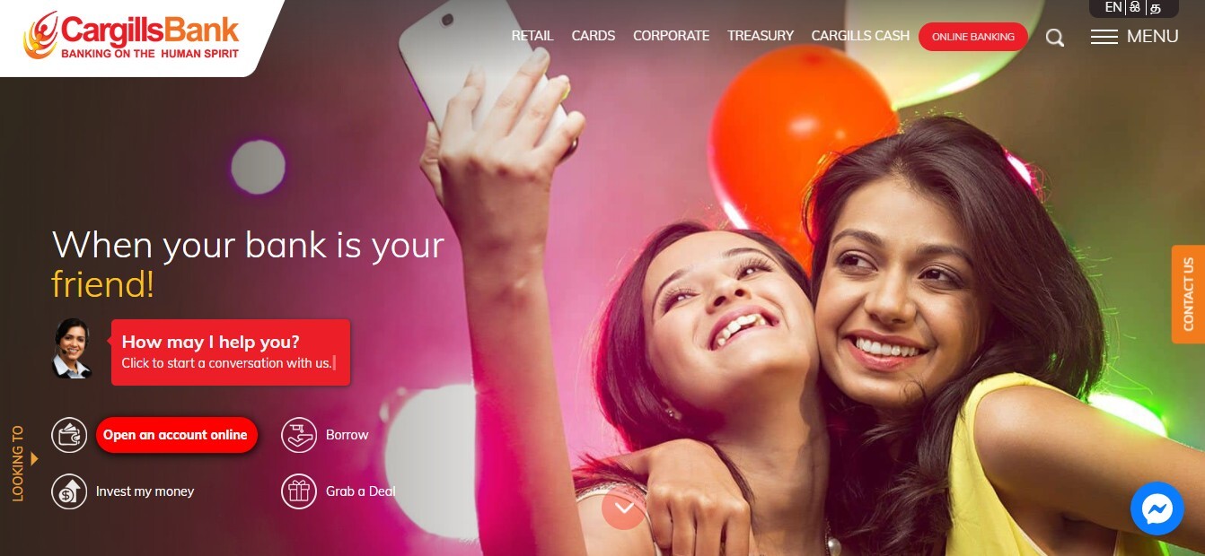
Cargills Bank Limited is a licensed commercial bank situated in Sri Lanka. The website has beautiful vibrant colors that give it a fun look. The online chat feature and Facebook messenger app pop-ups make it easy for customers & visitors to reach out to the bank for any help. However, Cargills Bank puts everything you need straight at your fingertips. You will easily see the savings & return rates accompanying bank hours on the home screen. A red-colored call-to-action button stands out from other menu items and directs you to the online banking link. To establish an optimal customer experience, the online chat and apply now options continue to pop up on the products and services pages.
11. BBVA
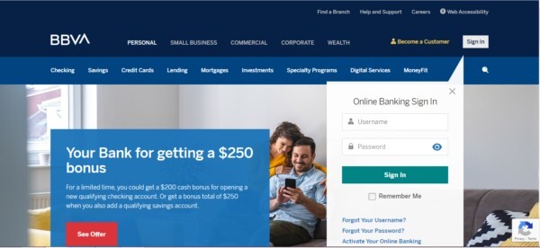
BBVA is a bank holding company headquartered in Birmingham, Alabama. The US-based bank offers a wide array of financial services & products for a varied audience, making it challenging to maintain clean and easy navigation.
Coming to the design of the bank website, I genuinely liked that they have maintained a clear visual hierarchy that funnels users into the website’s appropriate section, allowing them to find the information they need without much of a hurdle. Also, using blue color and its overlays help easily portray the brand’s vision and message.
12. NBKC Bank
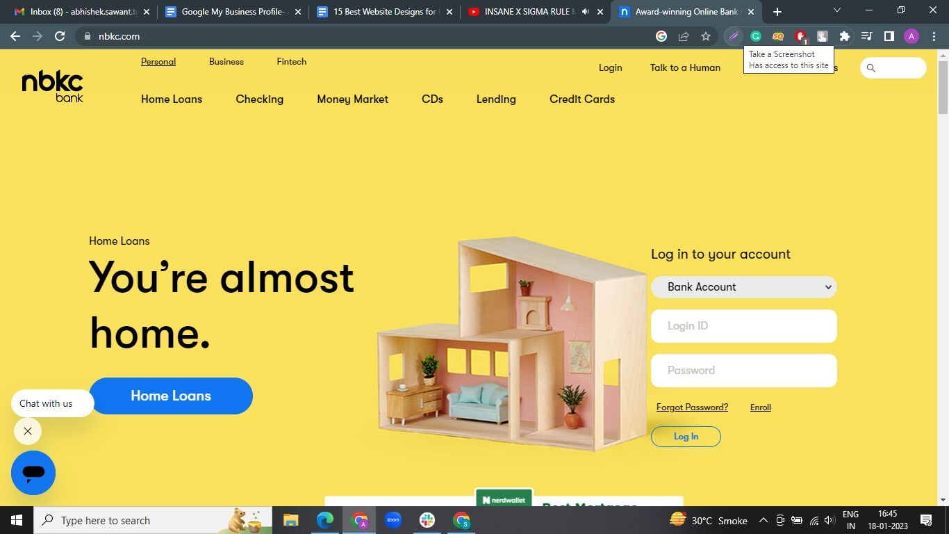
The homepage of the NBKC Bank is the highlight of the bank’s website. It offers a calm and relaxing feel compared to other banks' vibrant website designs.
Sometimes, we don’t trust banks easily. NBKC Bank has used customer testimonials to establish credibility and authority among the audience.
The bank also enables efficient communication with the client, offering them the use of live chat at specified hours.
13. Bremer Bank
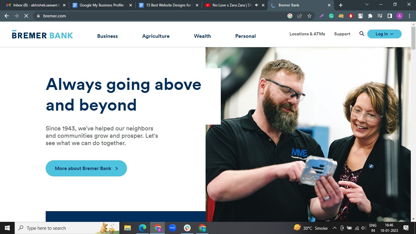
When you land on the Bremer Bank’s website, it spells “professionalism.” A great copy establishes their brand positioning. The blue and grey color palette contrasts nicely with the Bremer Bank logo. This, along with the compartmentalization of information into a grid-like design, helps provide a visually appealing experience and easy navigation to key information segmented to meet customer needs.
14. Texas Capital Bank
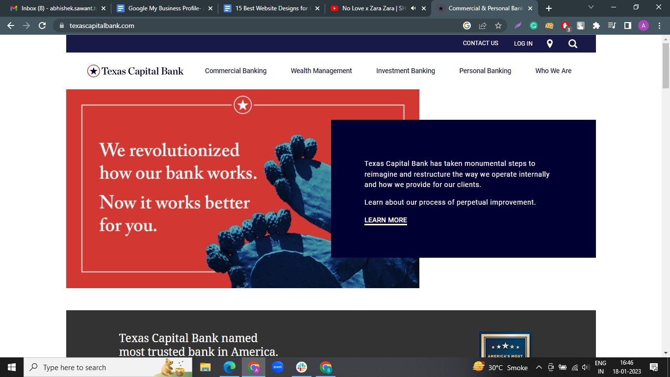
Texas Capital Bank has a clean, professional, and modern responsive design, but what really sets it apart from the others on this list is its attention to effective content. The bank has utilized SEO pages in a very wonderful way. They have created individual content pages targeted to specific industries that help them rank higher in search engine rankings.
The website has a slick responsive design, trust signals from Newsweek on the homepage, clear calls-to-action, ongoing content creation relevant to their audience, and multi-level navigation that helps their visitors quickly find what they need.
15.Byline Bank
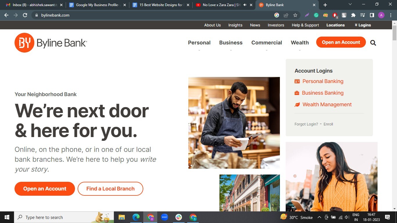
Byline Bank doesn’t overstate the site with their brand’s orange color, instead using it as an accent in key areas such as the call-to-action buttons. This, in contrast to the backdrop remaining mostly grayscale, helps to bring the user's attention to where it matters most without overwhelming them with too much vibrance. The bold font helps convey their message, so prospects do not need to look for too long to find what they need.
Also read - what makes website attractive for your customers!
Conclusion
Everyone knows that first impressions are critical for maintaining client relationships, but it becomes more evident for online users. The face of the company is your website, and it's the first impression your potential customers will perceive in their deliberation.
Are you a bank or financial institution? Do you want to create a new world-class website? Or do you want to redesign your existing website? Get in touch with the 12Grids team.
Author

