1/6
Laws of Common Region
Takeaway
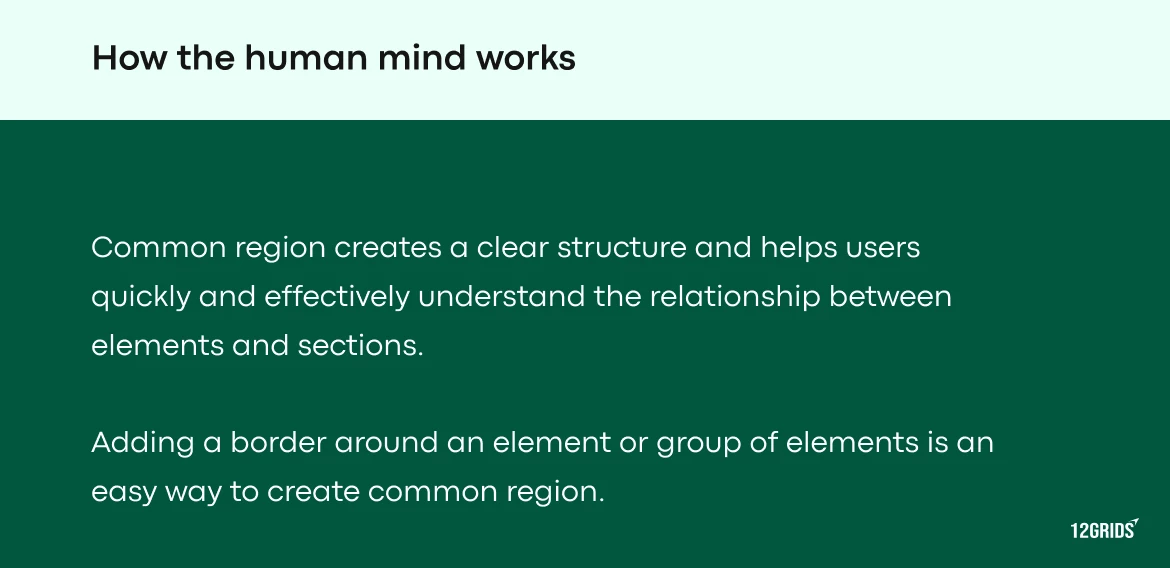
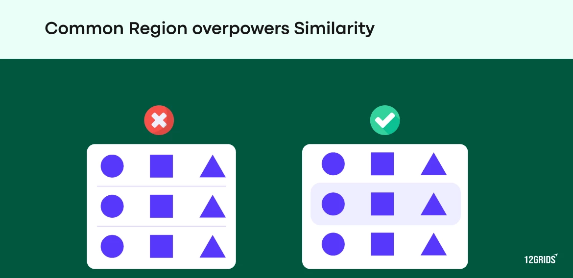
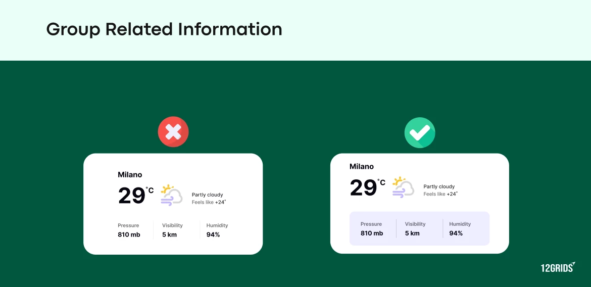
- Elements within the same boundary are perceived as related.
- Use visual boundaries (like cards, boxes, or containers) to group related items.
- Clear boundaries between different sections enhance comprehension.
- This principle helps in structuring content into easily scannable sections.
- It is particularly effective in forms, menus, and navigation layouts.
Origins
The Law of Common Region is one of the Gestalt principles of visual perception, developed by German psychologists in the early 20th century. Gestalt theory posits that people naturally organize visual information into structured groups. By creating clear boundaries around related items, designers can improve the user’s ability to quickly understand and interact with content.
Credits
Share

Subscribe for the latest updates
Join 50,000 creatives to enjoy a regular dose of inspiration and motivation, delivered to your inbox every Tuesday.


.webp)
